

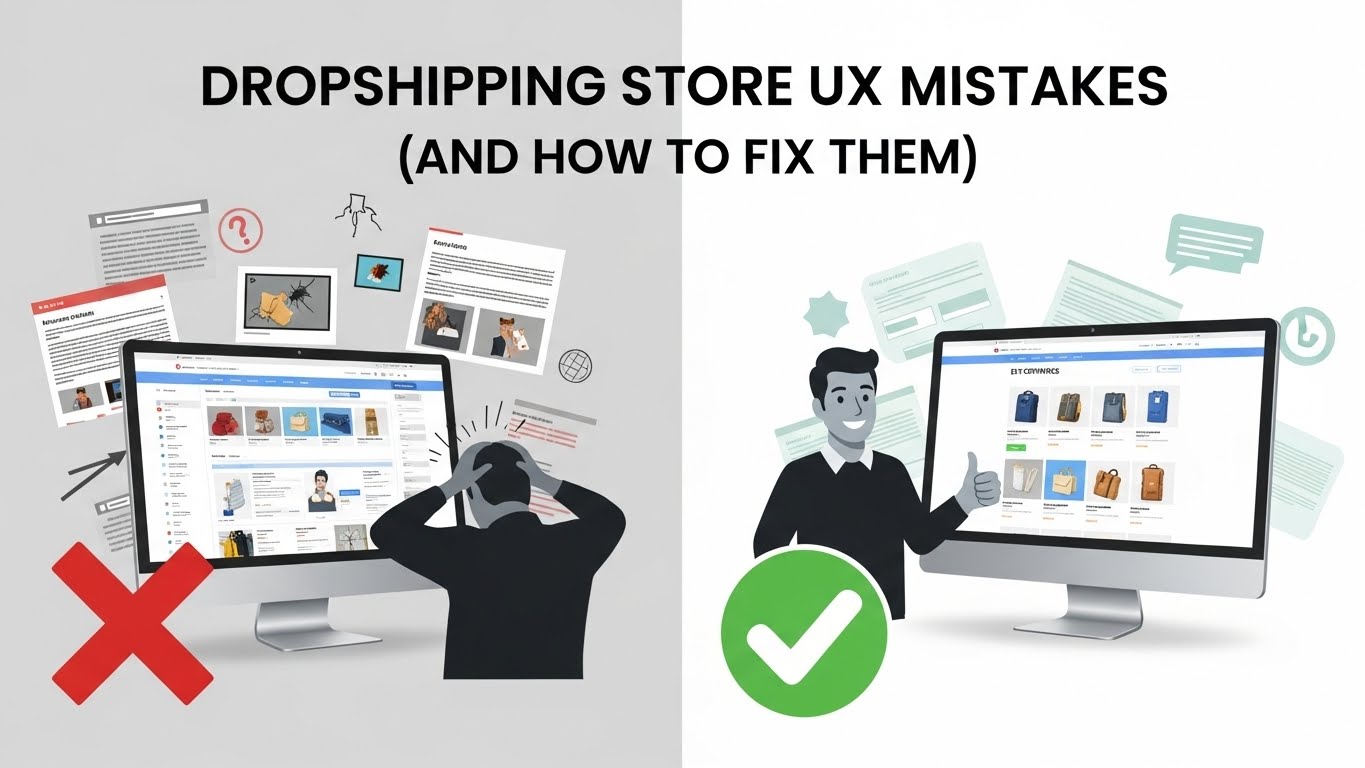
If your dropshipping store looks “fine” but isn’t converting, UX is probably the silent issue.
I’ve reviewed enough dropshipping stores to say this confidently: most don’t fail because of bad products or ads. They fail because the shopping experience creates friction at every step — small things that add up to hesitation.
This article breaks down the most common dropshipping store UX mistakes, why they hurt conversions, and what to do instead. No theory. Just practical fixes.
What UX Means in a Dropshipping Context
UX isn’t about making your store look impressive.
It’s about how easily a visitor can:
- Understand what you sell
- Trust your store
- Complete a purchase
Good UX feels invisible. Bad UX feels uncomfortable — even if people can’t explain why.
Mistake #1: Making the Store Feel Generic
This is probably the biggest issue I see.
Same layout. Same colors. Same product images. Same copy.
When everything feels interchangeable, trust drops immediately.
Why This Hurts Conversions
People hesitate when a store feels replaceable. They assume:
- Low quality
- No support
- No accountability
What to Do Instead
- Use consistent brand colors
- Customize section headings
- Add a real brand story (even a short one)
You don’t need a full brand identity — just intentional choices.
Mistake #2: Overloading the Homepage
Many dropshipping homepages try to do too much.
Pop-ups, banners, timers, sliders — all competing for attention.
Why This Hurts UX
Cognitive overload leads to indecision. Indecision leads to exits.
Fix
- One main goal per page
- One primary CTA
- Remove anything that doesn’t support buying
If something doesn’t help the visitor move forward, it’s noise.
Mistake #3: Weak Above-the-Fold Product Pages
First impressions happen fast.
If visitors land on a product page and can’t instantly tell:
- What the product is
- Why it matters
- How to buy
They leave.
Fix Checklist
- Clear product title
- Strong main image
- Visible price
- Obvious “Add to Cart” button
No scrolling required.
Mistake #4: Poor Mobile Experience
Most dropshipping traffic is mobile. Yet many stores are still designed desktop-first.
Common Mobile UX Issues
- Tiny text
- Hard-to-tap buttons
- Long paragraphs
- Cluttered layouts
Fix
- Test on your own phone
- Use sticky add-to-cart
- Collapse long sections
If it’s annoying to use, it won’t convert.
Mistake #5: Fake or Overused Trust Signals
Visitors are smarter than we give them credit for.
They can spot:
- Fake reviews
- Generic badges
- Over-the-top urgency
Why This Backfires
Forced trust signals create suspicion instead of confidence.
Better Approach
- Real reviews with context
- Clear shipping and return policies
- Simple, honest copy
Trust is built through clarity, not pressure.
Mistake #6: Confusing Navigation
Some stores make browsing harder than it needs to be.
Too many menu items. Poor labeling. Hidden categories.
UX Rule
If users have to think about where to click, something’s wrong.
Fix
- Keep menus simple
- Use familiar labels
- Highlight best sellers
Dropshipping stores work best when navigation is obvious.
Mistake #7: Inconsistent Visual Hierarchy
When everything looks important, nothing is.
Symptoms
- Same font size everywhere
- No spacing between sections
- Too many colors
Fix
- Clear headings
- Consistent typography
- White space
Good UX guides the eye naturally.
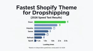
Mistake #8: Slow Page Load Times
Speed is UX.
A slow store feels untrustworthy, especially to new visitors.
Common Causes
- Heavy images
- Too many apps
- Large videos above the fold
Fix
- Compress images
- Remove unused apps
- Load extras only when needed
A fast store feels professional.
Mistake #9: Complicated Checkout Experience
You can do everything right and still lose the sale here.
UX Killers at Checkout
- Unexpected fees
- Forced account creation
- Too many form fields
Fix
- Be transparent early
- Offer guest checkout
- Keep it simple
Checkout should feel effortless.
Mistake #10: Designing for Yourself, Not the Customer
This one is subtle but dangerous.
What you like doesn’t matter.
What matters is what helps a first-time visitor feel confident enough to buy.
Fix
- Watch real users navigate your store
- Look at heatmaps and recordings
- Pay attention to drop-off points
UX improves when you observe, not assume.
Final Thoughts: UX Is a Conversion Multiplier
Fixing UX won’t magically make bad products sell.
But good UX amplifies everything else:
- Ads perform better
- Trust increases
- Conversions improve
Most dropshipping store UX mistakes aren’t dramatic. They’re small, fixable, and often overlooked.
Clean up friction. Simplify decisions. Make buying feel easy.
That’s good UX — and good business.


Pingback: Impulse Theme Shopify: 11 Proven Reasons to Choose It