

Great products don’t sell themselves online. Experience does.
On Shopify, user experience (UX) directly affects conversion rate, SEO performance, repeat purchases, and brand trust. Many stores fail not because of pricing or traffic, but because the buying journey feels confusing, slow, or overwhelming.
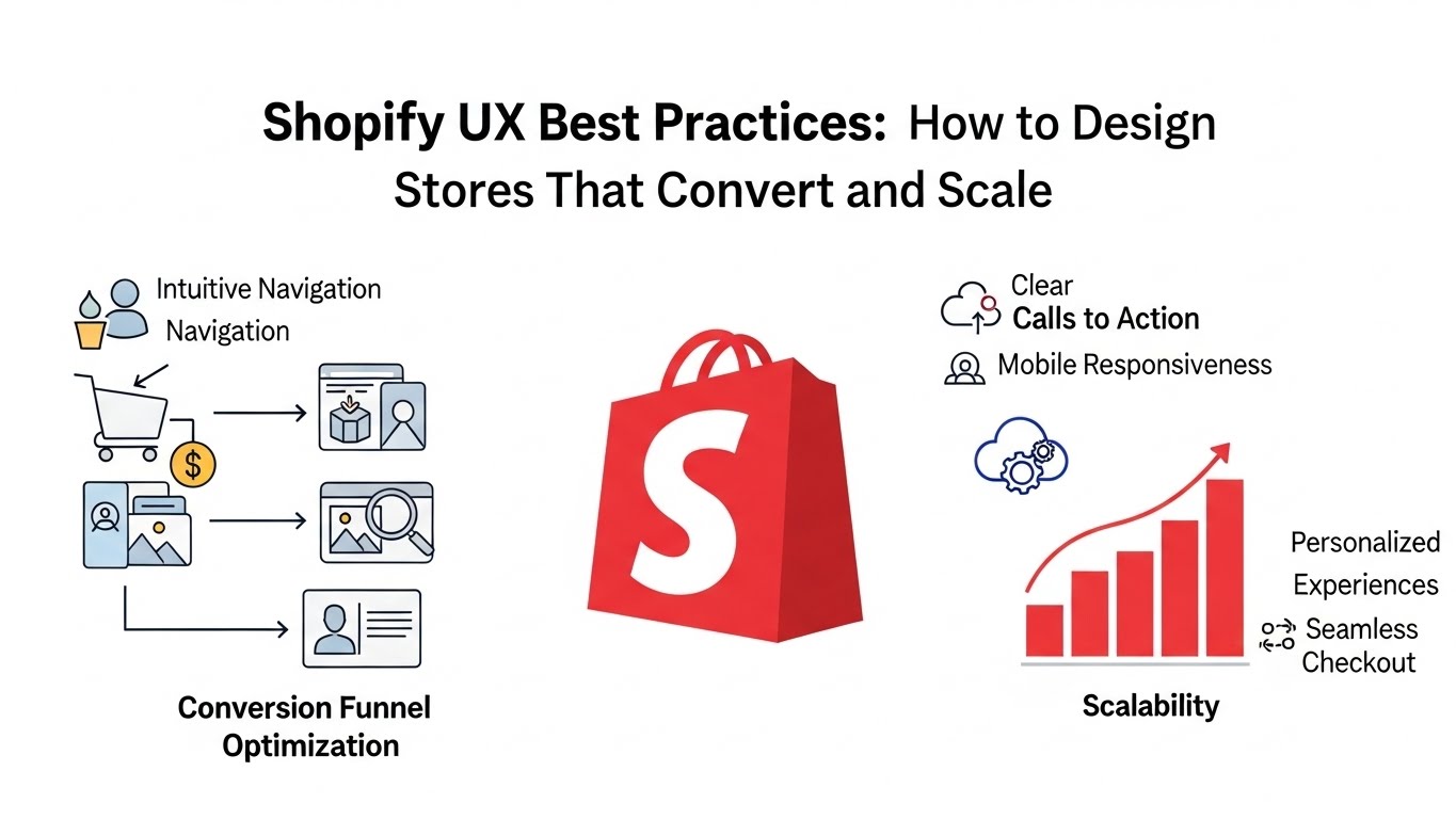
This guide breaks down Shopify UX best practices used by high-performing ecommerce brands. These principles are practical, platform-aware, and grounded in how real customers browse, compare, and buy in 2026 and beyond.
What Is Shopify UX (and Why It Matters)
Shopify UX is how customers experience your store from entry to checkout:
- How easily they find products
- How fast pages load
- How clear pricing, shipping, and policies are
- How confident they feel clicking “Buy”
Good UX reduces friction. Bad UX creates doubt.
Every extra second of load time, every unclear button, and every unnecessary step costs revenue.
Core Shopify UX Principles (The Foundation)
Before tactics, understand the fundamentals.
1. Clarity Beats Creativity
Users don’t want to “figure out” your store. They want clarity.
- Clear navigation
- Obvious CTAs
- Predictable layouts
Creativity should support understanding, not replace it.
2. Mobile-First Is Non-Negotiable
Most Shopify traffic is mobile. Design decisions must start with small screens.
If it doesn’t work well on mobile, it doesn’t work.
3. Reduce Cognitive Load
Every choice you present costs attention.
Good UX:
- Limits options
- Groups information logically
- Guides decisions step by step
Homepage UX Best Practices for Shopify
Your homepage answers one question instantly:
“Am I in the right place?”
Above-the-Fold Essentials
Within the first screen, users should see:
- What you sell
- Who it’s for
- Why it’s different
- One clear primary action
Avoid rotating sliders. Static heroes convert better and load faster.
Visual Hierarchy Matters
Use:
- One dominant headline
- One primary CTA
- Supporting imagery, not competing elements
Whitespace is not empty space—it’s a usability tool.
Feature Collections Strategically
Don’t show everything.
Highlight:
- Bestsellers
- New arrivals
- Seasonal or problem-based collections
This reduces overwhelm and improves product discovery.
Navigation & Menu UX Best Practices
Navigation is one of the biggest UX failure points on Shopify stores.
Keep Top Navigation Simple
Best practice:
- 5–7 top-level items max
- Use clear, descriptive labels
- Avoid clever wording
“Shop” is less helpful than “Men,” “Women,” or “Collections.”
Use Mega Menus for Large Catalogs
For stores with many products:
- Group by category, not brand jargon
- Include visual cues sparingly
- Make it scannable, not dense
Optimize Mobile Menus
Mobile nav should:
- Open fast
- Use accordion-style categories
- Avoid deep nesting
Thumb-friendly spacing matters more than aesthetics.
Collection Page UX Best Practices
Collection pages are SEO + UX powerhouses when done right.
Add Context Above the Product Grid
Include:
- Short intro text (2–4 lines)
- What problem the collection solves
- Who it’s for
This helps users and search engines understand relevance.
Filters Should Help, Not Hurt
Best practices:
- Filter by attributes users expect (size, price, color)
- Avoid overwhelming filter lists
- Keep filters sticky on mobile
Bad filters increase bounce rate.
Consistent Product Cards
Each card should show:
- Product image
- Name
- Price
- Quick decision cues (rating, tag, variant hint)
Inconsistency slows decision-making.
Product Page UX Best Practices
Product pages are where UX directly equals revenue.
Prioritize the Buying Decision
Above the fold should include:
- Product title
- Price
- Key benefit or outcome
- Clear add-to-cart button
Do not push critical info below long image galleries.
Write for Scanners
Use:
- Bullet points
- Short paragraphs
- Clear subheadings
Users skim before they commit.
Reduce Purchase Anxiety
Strong UX addresses fear:
- Shipping time clarity
- Returns policy visibility
- Trust badges and reviews
- Real product photos
Unanswered questions delay purchases.
Sticky Add-to-Cart (Mobile Especially)
Sticky CTAs improve conversions when used responsibly:
- Keep them small
- Avoid covering content
- Show selected variant clearly
Checkout UX Best Practices (Where Most Revenue Is Lost)
Checkout should feel boring—in a good way.
Minimize Steps
Shopify’s native checkout is strong. Don’t complicate it.
Best practices:
- Enable guest checkout
- Reduce form fields
- Auto-detect address data
Transparency Builds Trust
Display:
- Total cost early
- Shipping fees clearly
- Delivery estimates
Surprises kill conversions.
Optimize for Mobile Completion
Ensure:
- Large input fields
- Numeric keyboards for numbers
- Minimal scrolling
Checkout UX is about friction removal, not persuasion.
Speed & Performance UX Best Practices
Speed is UX. UX is SEO.
What Hurts Shopify UX Most
- Too many apps
- Heavy pop-ups
- Large uncompressed images
- Third-party scripts loading on every page
Every extra script increases interaction delay.
What Helps
- Use themes with clean code
- Limit global app scripts
- Compress and resize images
- Lazy-load non-critical assets
Fast stores feel more trustworthy and convert better.
Content UX Best Practices
UX is not just design—it’s content structure.
Use Clear Headings
Good headings:
- Help scanning
- Improve accessibility
- Support SEO
Avoid walls of text.
Match Tone to Audience
Luxury brands ≠ casual copy
Tech products ≠ lifestyle storytelling
UX improves when language feels familiar to the user.
Avoid Marketing Fluff
Words like “revolutionary” and “game-changing” add noise, not clarity.
Specifics convert better than hype.
Accessibility Is UX (Not Optional)
Accessible stores convert more users.
Best practices:
- Proper contrast ratios
- Readable font sizes
- Keyboard navigation support
- Alt text for images
Accessibility improvements often improve SEO and usability for everyone.
Common Shopify UX Mistakes to Avoid
- Designing for desktop first
- Using autoplay videos everywhere
- Hiding critical info behind tabs
- Overusing pop-ups
- Forcing account creation
- Copying competitors without context
Good UX is intentional, not copied.
UX and SEO Work Together
Search engines increasingly reward good experience.
Strong UX leads to:
- Lower bounce rates
- Longer dwell time
- Higher engagement
These are indirect but powerful SEO signals.
UX is not just about conversions—it’s about discoverability.
Shopify UX Best Practices Checklist
Use this as a quick reference:
- Mobile-first layouts
- Clear navigation labels
- Fast-loading pages
- Simple homepage messaging
- Scannable product pages
- Transparent checkout
- Limited app bloat
- Accessible design
If your store meets most of these, you’re ahead of the average Shopify site.
Final Thoughts
Shopify UX best practices are not trends. They’re principles rooted in how humans make decisions online.
You don’t need a flashy redesign. You need:
- Fewer obstacles
- Clearer messaging
- Faster interactions
When UX improves, everything else—SEO, conversions, retention—improves with it.
Treat UX as an ongoing system, not a one-time task, and your Shopify store will compound results over time.


Pingback: Best Shopify Themes for SEO (2026) – 11 Fastest Themes Tested for Rankings
Pingback: Best Shopify Themes for Dropshipping 2026 Guide
Pingback: Binim Responsive Shopify Theme Review 2026 ($24) – Is It Worth It for Fashion Stores?